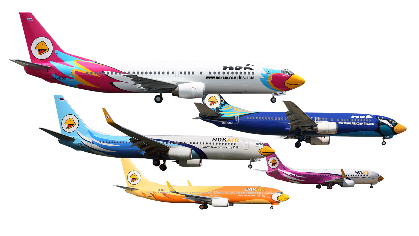
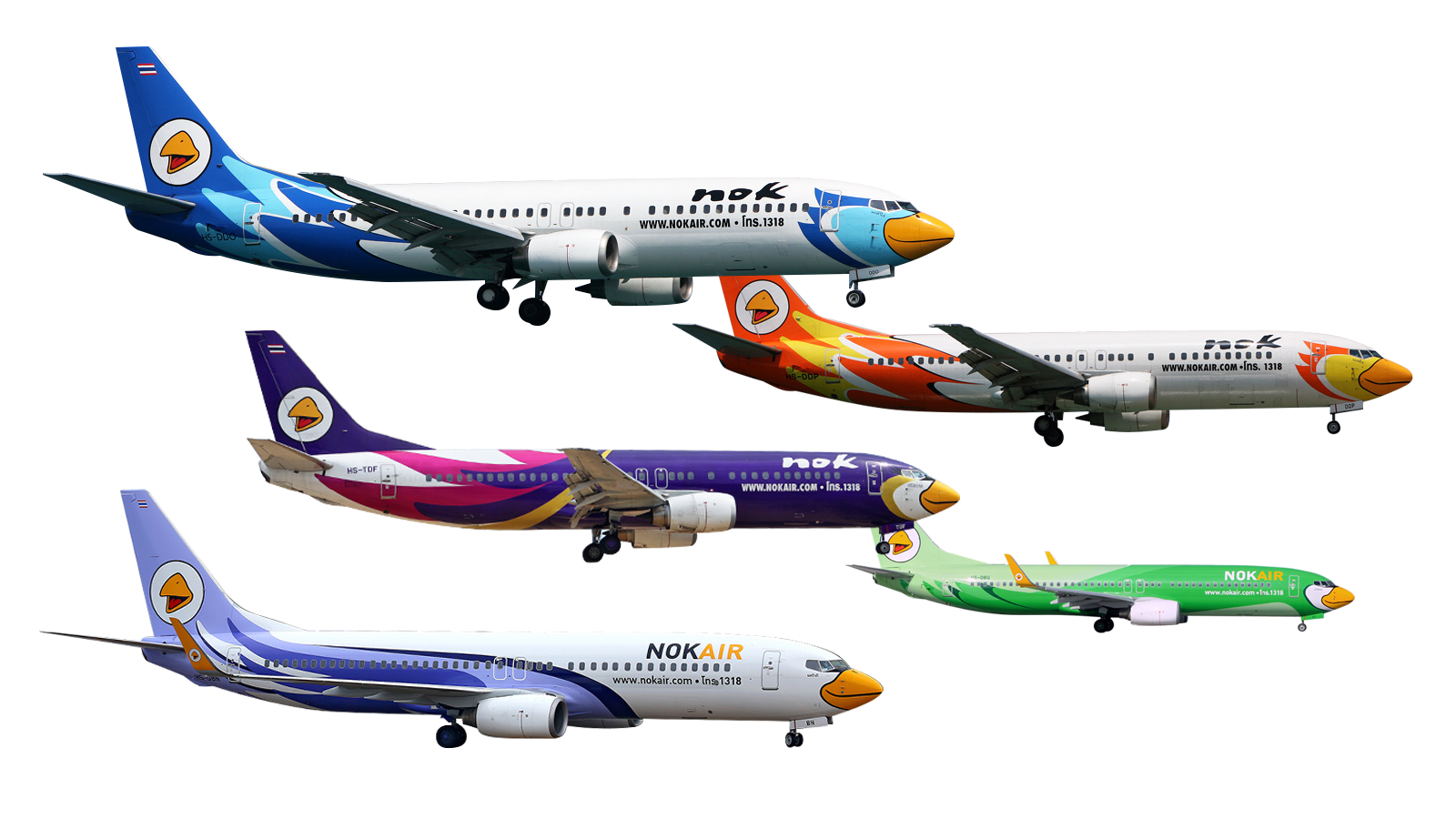
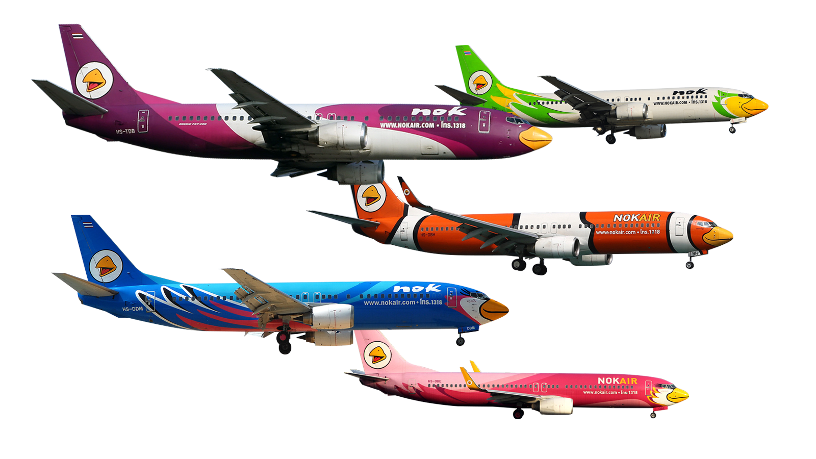
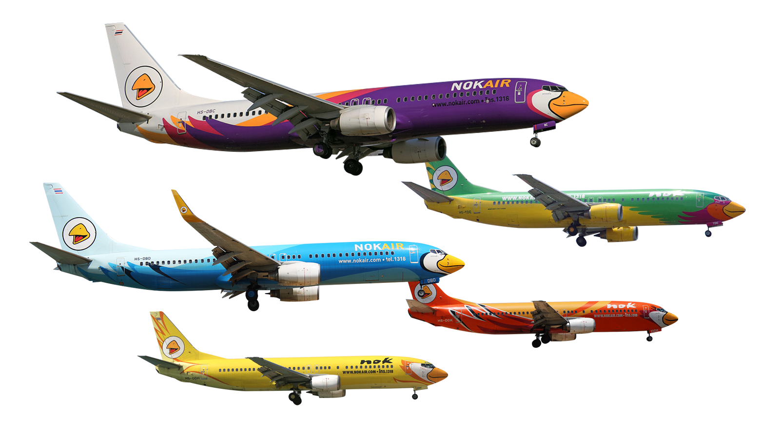
NokAir plane designs
![]() extending the CI and brand identity on the carrier
extending the CI and brand identity on the carrier
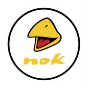
Client: NokAir
Media: plane design
Background:
The brand name NOK in Thai means BIRD. When we designed the corporate identity and logo of NokAir, we wanted to emphasize the thought that there are more than just one species of bird in nature. NokAir should stand for the universal idea of ‘bird’, something friendly that flies through the skies. That’s why the NokAir logo only depicts a beak and leaves it to the observer what type of bird might be attached to it.
Design idea:
The bird’s beak of the logo was adapted to the plane’s front end and the plane automatically became a bird. But like in nature, there are numerous bird feather designs, so every plane of NokAir was to be designed differently.